Windows customization isn’t anything new, but with Windows 7, customization got a lot easier with theme packs. Here is how you can create your own theme pack from scratch.
Creating a theme pack from scratch is a lot more work than using built in tools, but it gives you a lot more flexibility by allowing you to creating brand icons, RSS background feeds, and customizing every feature which may not be easy to do through Windows native tools. When you are going to create a theme that you can share with others you will want to take into account what exactly you will be able to change that others will be able to use. Windows 7 theme packs allow you to customize the desktop background (including “slide show” backgrounds, and RSS feed backgrounds), screen saver, system sounds, desktop icons, mouse pointers, and system colors.
Customize your theme
Start the theme pack by gathering all the files you want to use for your customization. Remember to get items for every part you are going to customize. If you do not specify parts to theme, the system will use the defaults that come with windows. So if you don’t find a mouse cursor you like, Windows will use the default cursor for the system. Once you have the files you want, put them all in a folder that you can easily get to. I am going to be building a theme based on the Matrix wallpapers we posted recently.

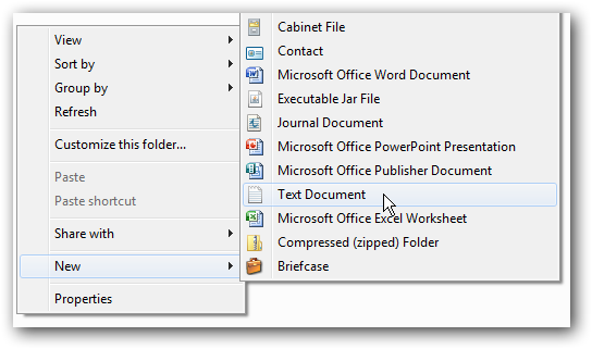
We will start the customization by generating the .theme file. This file is the heart of your theme pack and will tell Windows which media file to use where. The .theme file is really just a specially formatted text file so start by right clicking in your folder and creating a new text document. Name the file whatever you want and open it with your favorite text editor.
The .theme file is going to be broken up into sections. The first section is the [Theme] section. The [Theme] section only has two options, the theme display name, and the theme icon. The display name can be whatever you want the theme to be called in the control panel > personalize window, and the icon graphic must be a PNG file. The graphic will be scaled to 80×240 so use something close to that resolution or ratio.
Note: The theme icon will only show up under the Control Panel > Personalization window so don’t worry if you don’t see the icon.

The rest of the [Theme] section will tell windows which icons to use for the desktop icons (Computer, Documents, Recycle Bin, Network). For icon files you can use either standalone.ico files, or you can use icons embedded in .exe or .dll files also. For .exe and .dll files you need to specify which icon to use with a comma and then say which icon you are going to use. (my.exe,0 or my.dll,-50). Each desktop item has a unique screen that identifies it so make sure you use the right string for each item.
Computer = [CLSID{20D04FE0-3AEA-1069-A2D8-08002B30309D}DefaultIcon]
Documents = [CLSID{59031A47-3F72-44A7-89C5-5595FE6B30EE}DefaultIcon]
Network = [CLSID{F02C1A0D-BE21-4350-88B0-7367FC96EF3C}DefaultIcon]
Recycle Bin = [CLSID{645FF040-5081-101B-9F08-00AA002F954E}DefaultIcon
Below each item you will specify the icon with DefaultValue except the Recycle Bin which will use values Full and Empty.
After the [Theme] section is the optional [Control PanelColors] and [Control PanelCursors] sections. The colors section would be extremely hard to adjust manually but if you really want to try it you can adjust the following items using RGB codes.
Note: RGB codes range from 0-255 and are separated by spaces. So black is 0 0 0 and white is 255 255 255.
ActiveTitle, Background, Hilight, HilightText, TitleText, Window, WindowText, Scrollbar, InactiveTitle, Menu, WindowFrame, MenuText, ActiveBorder, InactiveBorder, AppWorkspace, ButtonFace, ButtonShadow, GrayText, ButtonText, InactiveTitleText, ButtonHilight, ButtonDkShadow, ButtonLight, InfoText, InfoWindow, GradientActiveTitle,
GradientInactiveTitle
Instead of doing this section by hand you could also adjust the colors using the control panel > personalize > colors, and then save the theme file and then just copy and paste the colors section into the theme you want.

The [Control PanelCursors] section has an option for which .cur or .ani files you want to use for each cursor. The valid cursors you can replace are the following:
Arrow, Help, AppStarting, Wait, NWPen, No, Size, SizeWE, Crosshair, IBeam, SizeNWSE, SizeNESW, SizeAll, UpArrow
If not cursor is defined the system defaults will be used.

After these two sections comes the first mandatory section and that is the [Control PanelDesktop] section. If you do not have this part of the file the theme will not be recognized as a valid theme. In here you will specify what the wallpaper image will be, how the image will be displayed and if the image is tiled or not. The three values you need are Wallpaper, TileWallpaper, and WallpaperStyle.
Wallpaper can be a .bmp, .gif, .jpg, .png, or .tif file. TileWallpaper is either a 1 or 0; 1 indicates the wallpaper should be tiled while 0 disables the tile. WallpaperStyle can be the following values. 0 means the image is centered, 2 means the image is stretched, 6 will fit the image to the screen, or 10 will will resize and crop the image to fit the screen.

After you have the [Control PanelDesktop] section defined you can move on to the next optional section [Slideshow]. [Slideshow] is how you can make rotating backgrounds for Windows 7. This section has the following attributes: Interval, Shuffle, RSSFeed, ImagesRootPath, Item*Path (* represents which pictures will be included in the slide show). The attributes can be defined with the following values: Interval shows the amount of time to wait before changing the wallpaper image (in milliseconds), Shuffle is a 1 or 0 to determine if images are displayed in alphabetical order or shuffled, RSSFeed points to the URL of the images RSS feed you want to use, ImagesRootPath is the folder containing your images, and Item*Path determines how many items are included in the slideshow. Each Item*Path entry points to one wallpaper image so you need to specify each image manually.
Note: ImagesRootPath and RSSFeed cannot be used together.

Following [SlideShow] is another optional section called [Metrics]. [Metrics] section shows dimensions of various display elements, such as the window border width, icon height, or scrollbar width. The NonclientMetrics and IconMetrics values are binary structures defined by NONCLIENTMETRICS and ICONMETRICS in winuser.h. In other words, you probably don’t want to edit this section by hand. If you are going to change the value of any window boarders I would suggest doing that through the control panel and saving the modified theme. Then export the [Metrics] section into your desired theme. Non-the-less, here is an example of a [Metrics] section.

Next is the required [VisualStyles] section. This section allows you to point to a .msstylesfile that can be modified for customization. If you use a .msstyles value in this section you will need to remove the [Metrics] and [Color] sections of your theme because the .msstyles will replace both of those sections. The valid attributes are Path, Color, Composition, Size, ColorizationColor, and Transparancy. These options makes it easier to customize an already existing theme. For example, if you set the path attribute to %SystemRoot%resourcesThemesAeroAero.msstyles you can easily begin customizing the default Windows Aero theme.

Following [VisualStyles] is the optional [Sounds] and [AppEvents] sections. For this section you can either specify each sound manually by using the path to a .wav file like so:
[AppEventsSchemesApps.DefaultSystemExclamation]
DefaultValue=
Or you can specify one of the built in sound schemes with
SchemeName=
You can use one of the built in sound schemes or specify the .dll file containing the theme.

Following [Sounds] is the [Boot] section. The [Boot] section only has one value for SCRNSAVE.EXE point this value to whatever .scr file you want to use for your screensaver.
Finally is the required [MasterThemeSelector] which only has one attribute and you don’t have a choice for the value. The only thing that goes in this section is MTSM=DABJDKT which indicates that the theme is valid.
Once you have all of the required and optional sections in the file, save the file to whatever you want to call it and change the extension from .txt to .theme. Make sure you are viewing known file extensions when changing the extension otherwise the true extension will be hidden.
Packaging your theme pack
The final step it to package all of your media into a .themepack file. The .themepack file is simply a .cab file with an extension change. So if you already have software that can create a .cab file, simply use that software to compress your theme folder with all of your media in it and change the extension. If you don’t already have a cab packing program you can check out CabPack which is freeware.

Here’s an example of the Matrix Theme we built from scratch.

Conclusion
Once you have your theme pack you can apply it to your own system before sharing it. If there is anything else that needs tweaking you can either go back and change it in your.theme file your you can change it through the Windows GUI and then re-save the theme for sharing. Now go out there and share your favorite theme tweaks with the rest of the world.
Links
Microsoft theme pack reference
CabPack